Friday, November 28, 2008

Govinda - Senses In Design


Design is everywhere. It must be able to relate to a wide range of people and engage them. The designer needs to create a design that will successfully fulfil the problem, whether it is to help sell an item or make an item more user friendly. The way we interact with a design is through our senses, whether its sight, touch, sound etc. For a design to be successful, it helps for the designer to familiar with the product and how it interacts with the viewer through the senses.
Being aware of how it feels, looks, sounds, smells and tastes, either literally or the connotation it gives can greatly improve a design.
Sight is obviously the most important aspect. The design must ‘work’. It should grab the viewer’s attention and be able to hold it for some amount of time. Visual stimulation is the key.
The other senses come after that and also play and important role in the overall effectiveness of the design.

Thursday, November 27, 2008

The Senses...Jamie

The Senses.

An amazing technique that i like to use sometimes to clear my mind and focus all my energy onto one object by using the senses. First i try to clear all prior knowledge on what the object is, what it does and pick it up as if it is a new discovery.

First i use touch:
To look at the way it sits in my hand, if its cold/hot, if it is friendly to touch like any sharp edges.

Next look and observe it:
This is a great way to see how it looks when it ornate, doing something, how it sits on the table, how the design of the object works, its purpose.

Then listen to the object:
What can you hear, does it make a sound, does it sit quietly, is the sound pleasant or harsh.

After is the smell of the object:
Does it have a smell, does it not, is the smell nice or harsh, does its smell attribute to the object, or just a facet of how it was made. 

Finally There is Taste:
Sometimes not needed, but in certain cases, is it sweet, is it sour, is it crunchy, or is it a liquid. 

There are many ways to use the senses to observe something and usually you will come away with a new perspective on the object, or a new thought on what it does, like something you didn't know before. As you can see the senses play a major role in how we create an object. It is a personal thing to, if you know you love something, that the person next to will not have the same view. Is this due to the feelings that a person has, or are our senses different. Can i smell something that someone else can't or can they hear something i can't. The senses make the reality we live in and when we design we are creating a new piece of reality that will in turn taken, without thought, through the senses.

Six Hat Thinking...

This is a creation of a situation where two people are talking where one is wearing the six hats. In this you will see how the hats change his view on things...

The White Hat...
"Dad can i go to the toilet?"
"Yeh there's one down there, and over there"
"Well i could go to that toilet, but it is all the way across the street. or i could go to that toilet but it looks pretty dirty... well i could start to go in that one that is dirty, then finish the rest across the street..."

The Red Hat...
"Dad can i go to the toilet?"
"I Guess"
"What do mean by 'I Guess' if i dont go i could get serious problems. why cant you understand what im going through."
"Ok Then Just Go"
"Don't get pushy your so mean all the time, you always hurt my feelings. Why?"
"Please just go"
"Ok but ill be a while cause ill be crying..."

The Black Hat...
"I gotta go to the toilet."
"Well go."
"Nah i don't want to. I bet its dirty, or there's no toilet paper, or there is probably someone in there, or i bet it smells really bad."
"Well don't then"
"Yeh but i bet my blater will pop, and then ill go to hospital. its too late now i probably won't make it any way..."

The Yellow Hat...
"Can I go to the toilet?"
"Yeh Sure."
"Are you serious, thank you so much. Your the best. Thank you Thank you Thank You. I hope i make it. there probebly just cleaned it so i bet it will be freshness all over..."

The Green Hat...
"Can I go to the toilet?"
"Yeh of..."
"TOO LATE!!!"
The Blue Hat...
"Can I go to the toilet?"
"Yep."
"Ok Good, now, how should i go? What do i need to do? Where should i go?..."

As you can see the six hats thinking can completely change a situation when placed into action.
This is a great tool for the designer as he/she is able to view things from all angles and thus being a success. 

Wednesday, November 26, 2008

LEE: Process

My process basically is threefold.

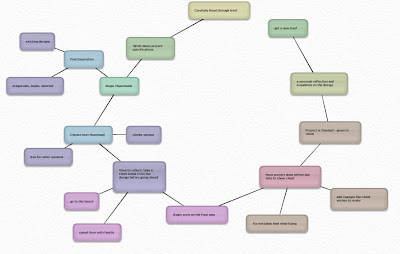
Uno: Receive brief and either crap my pants (hypothetically) or receive brief and be stoked on the idea of the project ahead.

Deuce: About midway through the allotted time for completion of the task at hand. I will begin to doubt basically everything. Either the stuff I have done I believe to be trash. Or the stuff I have not yet done is sure to be trash. I need something amazing/different or ill fail pretty chronic like.

Three: Later on there always comes a point where I go. "screw it, I am just going to do it and see what happens". Because i usually over analyze things and try to do things that i probably shouldn't. Or is not my style. Or try to be like other artists i have seen.

In the end after much doubt. Step three will usually set me straight and in most cases i will turn out with something that i dig.

True story.

Lee: senses

Some people believe that all senses are extremely important for design work. Some people do not.
To begin with. I was of the latter. Believing that the only sense required is sight. Otherwise you would not be able to see. Thus not be able to make anything decent.
But after much procrastination it struck me that the other senses are also valuable to design, though, of lesser value than that of sight.
-Touch: can be used to sample textures or the feel of objects, weights etc.
-Hearing: at first I thought. Designers use sound to design? yeah right. what are you gunna do? listen to the paper? no. Then i realised that i often listen to music when i am doing assessment tasks or tackling the ever horrid "Blog". The music in ways i do not know. Makes the process more smoothe, can somehow, clear creative blocks
-Taste: Who doesnt like eating paper?!.But really. I don't think taste has anything to do with anything. Except for lunch. which is an important part of everyones day. Especially after a hard day swearing at indesign.

Ah senses. What would we do without you?
If only this blog make sense.

Tuesday, November 25, 2008

STYLE-Kurt-


Some key factors to my style are

Monday, November 24, 2008

PAOLO - my process

I normally start of with closing my eyes and letting my imagination to go far, good ideas normally
are already there somewhere, they just need to be founded. In second analysis I go researching on the internet and try to find something amazing and very interesting that has  already been done in the past. Once I got inspired by it I try to understand how that has been realized. Than considering my qualities, abilities, skills I start realizing my own version of it and putting my own style on it. I think that our personality and style  is just a collage of other personalities that have been absorbed by yourself during the years and the process starts with copying from our parents after birth, for example without coping and improving the technology development would not exist and I would not be able to digitally writing by using this computer right now. Anyway I start brainstorming and formulating ideas, the ideas become sketches then thumbnails, template, refine, layout, print; then I prepare a suitable presentation and the job is done.

JOSH - senses


In the design process it is extremely important to use all your senses.
Sight - by looking at an object we can remember something with a name or shape.
Touch – helps us to remember or develop a stronger feeling about an object.
Smell – helps us to gain a greater description of the things.
Hearing – is letting us know what is happening around us but also can be a major factor in influencing our decision of the object.
All these senses work together to help us to obtain information’s about a design and produce the design.
We also are able to create objects to make the audience use there senses in viewing the object/s.

In today’s graphic development audiences are being challenged more and more to use there senses when viewing an object. Advertisement is a perfect example of this with there use of technology.
Because of this audiences are now able to build a relationship with products and objects.

:)

JOSH - quote one


When it comes to design I think it is important to have a method.
As a designer we can tell if a product has been produced with a method.
Although a good designer can make the end product look like it has been produced with no method.

Communication is key in the portrayal of method in sourcing feedback.
This feedback is sourced from the client, then this will be turned into a method and then produced again as the end product.

ROGAN : PROCESS


ROGAN : SENSES AND DESIGN


Bruno Munari states that every facet of design must maintain a relationship with the senses.  Whilst this is true, not all facets of design are able to communicate with every individual sense.  For example: obviously web design is not going to communicate beyond a visual level or a t-shirt design is not going to appeal to your sense of taste.  Design that does appeal to more than one of our senses can become far more successful.  Again an example : A card that has text that has been embossed and perhaps has a nice texture to it would also appeal to ones sense of touch as well as be visually appealing.  It is all related to a persons attraction to someone or something, put simply you will be more attracted to someone/thing the more of your senses are appealed to.  You are obviously going to be more attracted to the a person that looks good and smells good, rather than one who looks good but has life threatening body odour.  

www.senseofsmell.org
http://www.dolcevita.com/design/designers/munari.htm

The Senses - Tane

Go here. NOW.  

www.online-graphicdesign.com/multimedia/sensexperience/senses.html

As the monkeys have demonstrated, sense is an integral part of life. And I s'pose you have to be alive to practice graphic design (disputable though). So therefore, I think the senses are very useful. The sight monkey I feel presents the most truth though, that not all lights at the end of the tunnel are good. Hang on, I don't even know what its trying to tell me. Friggin confusing monkey advice. Forget it.
And the touch monkey. Jesus that was creepy. What the hell was wrong with that finger? The stuff of nightmares.
The taste monkey didn't give out advice: it just made me so very thirsty for an ice cream and root beer smoothie.
But as you can see, a flash movie can affect you later in life and even frighten you.

My personal opinion however is that sense is probably useless in digital design, apart from sight of course. emotions certainly play a part. Good graphic designers should take this into account.

PAOLO- A small reflection on the importance of our senses.

All right!!  I`ll try to express my opinion about the potential of our brain and then to talk about senses as a consequence  and  please permit me also to have you guys doing this terrifying experiment just before I start. lay flat your arms forward,  hold  your hands  like if you were clasping an object and now put them close to each other. What you are looking at is the size of your brain. Why did I say terrifying? Well because people normally think that their brain is bigger than that. No worries people, being smart is not just a question of size. Ok dude stop mucking around and go straight to the point (voice out field). Ok Ok...... Our brain works like

a computer it does have an operative system which is binary( thought and language) same as the computer (0,1). The language of scheduling 

                                         brain: Visual - Auditory –Sensory

                                         computer: Cobol – Basic – Fortran

This means that to program itself the brain needs a language that is divided in 3:  visual, auditory, sensory, they are 3 types of intelligence. In each individual only one is overridding. For examle a visual person gives more attention to informations recived by the eyes ( normally graphic designers are visual people) they would give more priority to what they see then to what they hear or touch. Recognizing  the 3 types is easy. Visual people : aesthetic, they take care of their image. Auditory people: analysis, valutation, they think continuously.  Sensory: relax, comfort, feelings, emotions.

The point is that if we want to communicate to other people not only in the graphic design world, but in our life in general we must learn how to develop the other languages in order to communicate  directly to the unconscious  of the other people so they can not only see the design but also feel it smell it and touch it and keep it real. We learn this, we will not have problems with our costumers in the future. To fall in love it`s necessary to touch, to see and to hear the other person (example). Making our presentation coming with music  it’s a way to add another kind of language (I really like the motion graphic also because the images move attended by music) , adding a perfume to the product or simply spraying a particular fragrance in the air before to start our presentation could have a better catch on customers(maybe this wouldn`t). At Dysneyland they use this sistem perfectly infact it is the turistic attraction more famous in the world.  Let me just talk about the cinema 3d . You go in and they give you 3d glasses (visual)so you can see in 3 dimensions, then you find yourself all surrounded by a Dolby stereo(auditive) then the chair starts moving( sensitive) and everything gets real………….knowing this is fondamental for selling.

One more thing, if you want have an intense experience about senses by reading, the book you are looking after is: " Proust and the sense of time"

enjoy it!


Sunday, November 23, 2008

The Senses & Design- Kurt


Sight
or vision is the ability of the brain and eye to detect electromagnetic waves within the visible range (light) interpreting the image as "sight."
I guess sight would have to be the first on the list when it comes to design and the senses, as we are visual artists and communicating through graphic design, it,s the first sense that we use when analyzing someone or thing.


Touch
also called mechanoreception or somatic sensation, is the sense of pressure perception, generally in the skin. There are a variety of (nerve endings) that respond to variations in pressure (e.g., firm, brushing, and sustained).
Touch would be 2nd in line when dealing with the design process as we generally process our ideas and pick up a pen or pencil to begin to transfer visual thoughts and ideas to paper.Touch is also important to us as we may have to design a 3 dimensional object that we can hold and really get a feel for how it will be.


Hearing
or audition is the sense of sound perception. Since sound is vibrations propagating through a medium such as air, the detection of these vibrations, that is the sense of the hearing, is a mechanical sense akin to a sense of touch, albeit a very specialized one.
I,m not sure if touch or hearing would come before another in the design process as they are equally as important as each other, in saying this if you are receiving a brief maybe at a meeting, hearing would be right along side sight as you are listening to the boss give you the brief and maybe reading it on paper at the same time. Personally sound is very important part of my design process as i find when there are distracting noises or sounds going on around me i find it difficult to be creative, and when i,m listening to my favorite music i will flow and work effectively.


Smell
or olfaction is the other "chemical" sense. Unlike taste, there are hundreds of olfactory receptors, each binding to a particular molecular feature. Odour molecules possess a variety of features and thus excite specific receptors more or less strongly. This combination of excitatory signals from different receptors makes up what we perceive as the molecule's smell.
Smell is also a major factor in the design process as our environment where we work has a lot to do with the quality of work that we are producing, for example i know when we are sitting in either of the computer rooms working away and the air conditioning isn´t on or the windows arn´t open there´s quite a strong smell of human odor so to say, and we really can,t be effectively creative.


Taste
or gustation is one of the two main "chemical" senses. There are at least four types of tastes that "buds" (receptors) on the tongue detect, and hence there are anatomists who argue that these constitute five or more different senses, given that each receptor conveys information to a slightly different region of the brain. The four well-known receptors detect sweet, salt, sour, and bitter.
Taste would have to be just as important as smell in the design process, the saying YOU ARE WHAT YOU EAT definitely sums it up. Something that is really important when doing good design is to be feeling top fit, you can,t work properly when your sick, hungover or hungry for that matter and good tasting food or drink is a major contributing factor to how the machine (us designers) will work.

JOSH - my process

Where Process Meets METHOD and MADNESS-Kurt

When process and method are discussed, they tend to be used interchangeably. However, while they are two sides to the same coin, they are different. Process is a naturally occurring or designed sequence of operations or events over time that produce desired outcomes.
Process contains a series of actions, events, mechanisms, or steps, which contain methods. Method is a way of doing something, especially a systematic way through an orderly arrangement of specific techniques. Each method has a process.
From a realistic standpoint, a design method is concerned with the “how” and defining “when” things happen, and in what desired order. Design Methods is challenging to implement since there are not enough agreed-upon tools, techniques and language for consistent knowledge transfer. Two people can therefore use the same method and arrive at different outcomes.

"Method" is the careful, systematic way that something intelligent is done. "Madness" is the strange, meaningless action of a crazy person. There is "method to one's madness" when what looks like strange and meaningless action (madness) is actually the result of a carefully reasoned plan (method). Example: "Give me a moment to explain; there is method to my madness." [This idiom comes from Hamlet by William Shakespeare, Polonius speaking: "Though this be madness, yet there is method in it."] Example: "We thought he was crazy to do it that way, but it turned out that there was method to his madness."

design; lani style


senses_ALEC


At first my conceptions of this senses blog had me stumped as I could not completely conceive how all five senses could influence the design process. Then while trawling the internet I found an aptly ironic website titled, www.endofcyberspace.com. It's contents contained an article published in the New York Times by Gregg Zachery which explored the deluded nature of designing a product wholly on a computer which was indeed intended for the real world. 

"Using computers to model the physical world has become increasingly common; products as diverse as cars and planes, pharmaceuticals and cellphones are almost entirely conceived, specified and designed on a computer screen. Typically, only when these creations are nearly ready for mass manufacturing are prototypes made — and often not by the people who designed them."


The article goes on to explain that the relationship between computer design and 'hands on' design is flimsy at best. It pushes the importance of the prototype, the proof print and the 3D hand made model, the need for something tactile to see, hear and touch and even taste!  As a designer myself I have witnessed first hand the folly of relying solely on computer based design. The alcohol label project is one instance in which I placed my full trust in a computer. To me the text seemed to be sitting in perfect harmony with the borders...until I proof printed it! The proof print in tactile, non computer based form showed many errors and allowed me to re-evaluate and refine the label. 


This article as well as Manari's quote has shifted and expanded my outlook on the design process by showing that you can never be satisfied with what's on the computer screen because nine times out of ten the printed, tactile version will look, smell, feel, sound and even taste different. So when designing for the real world I believe that all five senses must be considered - in every stage of the design process -  to achieve maximum success.

THE SENSES | leilani

"Every facet of the design process has to maintain a relationship with the senses. When you confront an object, you've got to touch it, smell it, listen to it... "

I wonder if Bruno Munari will ever know what he’s started. I can just imagine the people around the world that will take him word for word and touch the intangible, smell the unscented, or listen to things that were never meant to make sound. One things for sure, I might end up designing packaging for a toilet seat cover, but there’s no way I’ll be licking it.

Or will I?

I digress --- [and yes, I do know what that means]

I suppose what Munari is suggesting is that knowing a product is the key to designing for it. Can you design for coffee label without knowing the dark, rich, sweet love that caffeine-addict knows? Of course. But that doesn’t guarantee that what you produce will be effective. Neither does being the primary consumer for a product mean that you will design something that suits the product well. Love can be just as destructive as indifference. Any working designer knows that it would be impossible [if you want to eat] to have the all candlelight dinners and moonlight beach walks required for an intrepid romance, with every object that comes through your door.

A good design encompasses everything that the object stands for, and promotes it to the consumer accordingly. I also think that part of what he meant is that a design shouldn’t just satisfy the eyes, but the rest of the senses as well. Touch is one of the most overlooked. I know for myself, I like things with texture, shape, a differentiation in surface. Gloss, and matte. Rough and smooth. Its not just about how it affects you visually, but it’s the way it stirs the rest of the senses too.

http://SpunkOnAStick.deviantart.com/art/Lick-50298622

tane - style


my personal style has certainly come a long way since the pre-tafe days.


mystyle_ALEC


A hat for any occasion


The six-hat method is well known technique and is used by many, it allows you to really step back reflect and examine your work. Most people would probably use one or more of these hats unconsciously in their design process already. A more pessimistic person will often sport the black hats, where as the more wild or crazy designer might more readily adopt a yellow or green hat approach. By consciously going through the hats as you design, it can bring out flaws, or highlight strong points in the design that might previously have been missed. Thus making it a useful tool for any designer.

I used the six hat method when approaching the intimidating task of the CD design cover. Faced with the prospect of becoming trapped in indecision and running out of time I turned to the hats to help me. I started with the white hat, and looked at my information. I didn’t have much, just some CD cover inspiration and a loose grasp on the style of covers my genre most commonly used. I started there, researching further into RnB and Polynesian styled covers, hoping to find a link between. I was met with all the obvious clichés, on one side, bikini girls and bling, the other, palm trees and sand – sand for miles.

I sketched a few ideas and then progressed to the black hat when reflecting upon them. The designs were becoming dull and uninspiring. I got stuck there for awhile. Taking on the Blue hat I decided that it would take some green hat thinking to get my design process moving forward again. Eventually I came up with an idea to use samoan textures and patterns. More sketches and some strong coffee later, I casually tossed on the yellow hat to positively assess my idea – there was no way I was going near the black hat again. I stayed with this idea, and moved on to the last of the hats after I had finished a preliminary digital design, and emotive response. I showed it to other people, and looked hard at myself. The general feeling being that it definitely had the island feel that I was looking for.

And that is my story.


http://www.mindtools.com/pages/article/newTED_07.htm

Saturday, November 22, 2008

Abby - process

Abby - Research

Jacob Cass – designer


http://justcreativedesign.com/2008/02/01/logo-design-process-of-top-graphic-designers/


Jacob Cass says that research includes general reading on the industry itself
“...to know your client’s businesses is the next crucial step in making a logo successful”
But, you also need to do research into the actual logo style.
“This is where we seek out a look, a style, an approach or attitude, usually to attain a period or style that we are unfamiliar with, or to refresh ourselves with what is new or successful. Eg. Find logos of similar business’ and critique them.”

Wendy Stamberger

Designer Wendy Stamberger said “I look more for techniques and to ask myself why a certain logo looks corporate, or what makes a really good health care logo… or for example why do I like this logo and dislike that one?” Designers should do this to gain a better understanding of the industry and competition.

Gino


http://www.youthedesigner.com/2008/01/11/design-a-logo-the-ultimate-guide/

Gino’s approach to research for design is to brainstorm like crazy.
“Start looking up competitors, do Google image searches, write down keywords, do some mind mapping, and make sure you put everything down on paper!”

V.Ryan

“all research must be relevant to your project and constantly refer to the problem you are trying to solve”
V.Ryan on the http://www.technologystudent.com/designpro/resch1.htm site describes research for the design process in the following steps:

Go to the library and look up information
Collect information about a range of materials
Take photographs of anything that will help you in your research.
Interview someone who may be able to help you with your research.
Collect some existing examples of the type of product you are designing and test them.
Research ergonomics information
What are the environmental benefits of the products you have researched?
Make a survey and analyse the data
Find examples of some existing products and how much they cost.
Look on the Internet
look at the safety aspects
Investigate different colours and shades of colour and try them out
Look at how it could be mass produced

GEMMA: My Style / My Process


GEMMA : The Senses

The Senses in relation to the Design Process

Most often, the design process is seemingly depicted by the sense of sight. Seeing a design, pointing out flaws in its visual appearance or improving aesthetics that does not yet quite make it work for the client. However this is not always the case.
Within the design process lays key fundamentals to every successful design. As well as the most obvious being sight, the process also includes sound, smell, taste and touch.

It is important to use all your senses throughout the design process. As Munari suggests in his statement, “Every facet of the design process has to maintain a relationship with the senses…” we are able to draw conclusions about relating different senses to different stages of the design process. The senses can be described as the following:

Touch - allows a physical connection between the actual design and both the client and designer. This sense can also be referred to as the ‘feel’ of the design and the colours or images that may be chosen to give this impact on the public.

Sight - allows you to give a description of the design, what something looks like. Therefore, in relation the design process, one is able to make adjustment on how it could look better, be improved, or what they feel already is working well and appropriately.

Sound - lets you know what is happening. It is a basis of communication in the design process. Listening to target markets, clients, designer’s opinions and research all act as key elements to any successful design.

Taste - although one sense which is more likely to be forgotten in this process is sure enough impacted on through the design process of a product. As designers, we ask ourselves; how should a design look visually when considering a design for a certain kind of consumable product?


http://www.seaford.k12.de.us/it/pp/Senses_files/frame.htm

http://www.sciencemuseum.org.uk/on-line/brain/140.asp

Friday, November 21, 2008

Wednesday, November 19, 2008

Tracy: The senses in Design

According to some interior design experts, the sense of smell has a direct link to the emotions and memory. On a purely visual basis, the sense of smell can be evoked through the use of imagery which depicts aroma. Sight is apparently the most complex of the senses in terms of design. The possibilities are limitless, with the ability to focus on culinary aspects for example, for the evocation of all other senses. 

The selection of pleasing objects or solutions is often referred to as displaying good taste. This can also be related to the sense of taste as it is relayed in a visual context. Interior designers sometimes design for the sense of hearing by removing the interference of external noise and placing only desirable sounds into the environment. Visually the use of musical symbols or the inclusion of plush leather furnishings can evoke memories of sound. Textural elements such as leather or stone etc, can be incorporated into design in order to give a sense of tactility. All of these things can be reversed and used directly in order to effect the mood or inspirational tone of the artist's environment.


Monday, November 17, 2008

Rosalind - My Style,My Process

JADE: mystyle/my process

JADE: relating to the senses in the design process

Look, listen, touch, smell, taste to design...

Client: The Bean Coffee Shop & Ice Cream Parlour
Project: Logo Design

The Bean - a coffee shop and ice cream parlour wanted our designers to create a mascot for their new coffee shop and ice cream parlour. Some of the 'buzz words in their client brief - "Funky, fun, family-friendly, catchy, colorful but with some earthiness".

After the initial briefing with the client, the designers are already having to consider and relate to the many different senses at this early stage of the design process. The words “funky” and catchy” can be referred to music, so you have to “listen” to get the design started. “Fun” can be related to sight- bubbly shapes and colours for instants. And the word “colourful” can be related the taste and smell, in the case, the taste of icecream, sweet, sugary things and creamy coffee.


Once sent to the studio, our designers set about creating a series of character sketches, all based on a coffee bean, that could be integrated into the logo and marketing material.

The brown coffee bean mascot character relates to the warm feeling and rich taste of fresh coffee. 

In the case of The Bean, our designers went through several rounds of character development before settling on the final mascot that would form the main component of the logo. The Bean started off life as a 'cute' little fellah, and it wasn't until later versions did he develop his 'hip style'. In a few versions, our designers even placed a Mohawk hairdo (left) but that was nixed by the client as being too 'out there'. Then came the glasses and in the final version, a trendy goatee. His smug expression added to the overall 'coolness' and 'attitude' of the character.

The “cool” appearance of the mascot character can relate to “cool” and “funky” music, so here, it’s appropriate to “listen” to the design.

What has started as a fairly benign character finally had enough style to be incorporated into a logo. Complimentary fonts were selected, as well as a bright color scheme (to illustrate coffee and orange sherbert ice cream.

The bright colour scheme the designers chose to use relate to the sweet tastes of the sherbet icecream.
Once The Bean character was finalized, it was then scanned and turned into vector artwork. (necessary for most modern applications and traditional reproduction methods). The remaining sketches were archived should the client require images of The Bean mascot in various positions and/or activities. In the final stages of the project, the logo was set up for use on a host of marketing and promotion items.

http://freda.auyeung.net/5senses/
http://www.thelogofactory.ca/design-help-centre/technical/logo-design-process5.html

Sunday, November 16, 2008

Mystyle Tracy

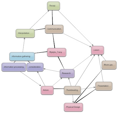
post4: your process

Illustrate your personal design process by use of an annotated drawing or diagram. you may like to use www.bubbl.us/. upload your post to the blog but also put in my dropbox- labelled mystyle_yourname. chosen format.
due 24.11.2008

Monday, November 10, 2008

Paolo METHOD


Hi folks, here is an example of method applied to the WEB DESIGN industry. I was surfing through italian websites about design when I found an interesting but also very simple method; It is called A.I.D.A by Marco Olivetti. He says that when they work on a website and "it must sell", a web designer can follow a method of development named 'Aida'. By this method you drive the attention of a customer on a specific path in the web site, to make him interested since the beginning (check out web sites of Future of Online Advertising). Let`s start describing this method composed by the letters of the word A-I-D-A.
A: Attenzione (attention): Grab the attention of the visitors straight away when they come on the homepage. Give them what they want.
I:  for Interesse (Interest) in this case we are talking about informations that make the visitors sticked to the web site, for example by showing the characteristic of the product you are selling.
D: Desiderio (Desire) kick up the desire of buying from your visitors, why they would have this product?
A: Azione (Action), Buy! Organize a comfortable system to have them buying your product , otherwise all the struggling would be useless and the visitors would abandon the web site, frustrated.


http://www.marcolivetti.com/comments/il-metodo-aida/

Sunday, November 9, 2008

DESIGN METHOD; leilani

Design and Method. Method, or process, is the vehicle that drives a design forward. Without it, it becomes easy to fall victim to the stagnant and unimaginative, or become overwhelmed. However, used in great excess, it can constrict and hinder the natural flow of a design.

Some consider it noble to have a method; others consider it noble not to have a method. Not to have a method is bad; to stop entirely at method is worse still. One should at first observe rules severely, then change them in an intelligent way. The aim of posessing method is to seem finally as if one had no method.”

At first glances, this quote boggles the mind – it seems a tangle of contradictions, undecipherable. My take is that with design method there must be balance. It must not become the focal point, and yet, it seems unwise to allow it to fall away completely.
  Method can be guides – gentle, assertive, prodding – or chains – restricting, unyielding and binding a designs capacity. Method must become part of design, flowing naturally out of the execution, it must be carefully considered but not allowed to rule.

This can be seen in the work of Graphic designer Dasche, in coming up with Brokers Bull design.
 His method moves through the usual channels of research and thumbnailing, which from him to in initial concept. When this is rejected he goes back, returning to research and drawing from inspirations until he comes up with a design that is functional and – most importantly – appeals to his client. His method is simple, but effective, and aids him well in the path from brief to design. 


As a good method
 should. 


http://www.dache.ch/index.php/dache/comments/case_study_brokers_logo_design_process/


Rosalind - Senses


It is extremely important to use your senses in the design process, sight summarizes things, lets us give them names by looking at the surfaces, touching is very immediate and feeling allows intimacy and thought about the object, when we smell we distinguish the basic possibility of the description of things and hearing is what is happening. All of these senses start you on the journey of possible design solutions.

Research and design in the field of human-product interaction has long focused on products visual properties. Nowadays it is acknowledged that the emotional and aesthetic experiences and understanding of products are determined by perceptions and sensations resulting from all our senses.

Using our senses in the development of designs has been the main reason to why some brands have become so hugely popular. Designs in brands have become more interactive due to their use; the public has been able to build a relationship with them.

So Bruno Munari was definitely on the pulse when he made this statement.


http://www.onderzoekinformatie.nl/en/oi/nod/onderzoek/OND1301292/
http://writingfiction.suite101.com/article.cfm/use_all_five_senses

The incredibly late stylings of lee henry: In "THE METHOD".

I would like to say that i understand the quote from the original post.
But the truth is. I have absolutely no idea what it is going on about.
I gathered form the first few lines that some people think it is good to have a method that they follow and some think it is good to not have a method. So i shall talk about that.
My theory is that having a method is like having a particularly stubborn cow tied to a rope.
Now you want to get the cow to the markets right?
But this cow is stubborn, it does not want to go to the markets. And being a cow, it is hard to move places where it does not want it to be.
Say the cow is a meat cow, designed for the harvesting of meat. And you want to milk the cow at the markets even though it gives cruddy milk. but superior meat.
Now if we put this in terms of graphic design, the cow is your method and you are trying to fit it into the "brief". Some times your method that is tried and true may not work at all, when trying to say, design a car. but you are a penny-farthing designer at heart. and end up designing yet another penny-farthing, because it is how you operate.
 So I personally believe that it is best to unleash your imagination for each different task you are performing. to highlight the differences between each task you do, and avoid repetition and/or failure.

This post, to you, the consumer, probably makes as much sense as the guidelines for this post did to me. So i tossed away all methods i have used on previous blogs and went at it.

JOSH - 6 hat thinking


The Six hat thinking method is a fictional way of thinking created by Edward De Bono. It involves the six ways in which people think about a situation. The red hat, white hat, blue hat, black hat, yellow hat and green hat.

-The white hat is worn when we focus on all the available data and make informed decisions based on what you learn from this.
-The red hat is where we look at the situation from an emotional viewpoint. This is where you look upon the situation with emotions and gut reaction.
-The black hat is often used by pessimists. The black hat allows us to look at the project in a negative way. We look at a situation and work out why it doesn’t work, this is good because it helps us to work out ways to improve it.
-The yellow hat is opposite of the black hat. It focuses on looking at the positive side and helps you push forward when things aren’t looking great for the situation.
-The green hat is worn by people who don't think and just do. The green hat stands for creativity and freedom. This is good for those that over analyzing something.
-The blue hat is the hat that governs other hats. Sort of the president of the united hats. If you dont know what hat to wear. The blue hat helps you make that decision.


8 panels
I personally had to use the Six hat thinking when it came time to design my eight panels for the corridor.
Red hat – I looked at the questions and decided what question I understood and thought I could work with best.
White hat –I then had to find available data that could be helpful for my idea.
Black hat - After not finding a lot of information in the area I wanted the direction I got quite confused and stuck in abit of a rut not knowing where to go next.
Green hat – so I just played on the computer for hours with drawing and placing different graphics and so on.
Yellow hat – the green hat really helped me to then take the yellow hat approach. i started to look at it in a different light. Becoming more confident and giving me a more positive direction as to where I would go.
Blue hat - By doing this I was able to see how I could still use my original idea, just put it in more of a less complicated form.

Abby – 6 thinking hats


Black hat – There are too many rainbow colours. Real apples aren’t rainbow colours. It doesn’t look modern. It is too bright and the colours aren’t organised in a nice order.


Yellow hat – I like the apple shape. It looks the right shape for a real apple. The bite looks works, it is different and more eye catching than a normal apple shape. It is a simple logo design that is easy to copy and easily recognised.


Red hat – It looks like a good apple to eat. It looks fresh, new and clean. The rainbows give a feeling of happiness


White hat – The rainbow colours match the spinning wheel icon on a Mac. It is a very recognised and successful business logo. When I first saw it I thought it was for selling fruit, when it was really for selling Mac it was computers.

Green hat – The logo would look better if it was a plain colour and looked more 3D. Black and white or grey gives an idea of digital, and is more appropriate for a computer. It is good to keep the same shape because everyone knows it.

Blue hat – Overall, the apple shape is very good but the rainbow colours aren’t relevant.


Fine wines

I am always interested in widening my experience of all things vinous so when asked if I would like to do a barrel tasting whilst in Bordeaux, I jumped at the chance. Barrel tasting involves sampling the one year old wine taken directly from the barrels they are aging in and gives a fantastic insight into the impact of the choice of barrel on the finished wine.

High quality claret is aged in oak barriques which hold 225 litres, 300 bottles, of wine. Due to the relatively low volume in each barrel and the relative high surface area of wine in contact with the barrel it can have a significant effect on both the taste and the structure of the wine. However in winemaking nothing is simple; the type of barrel can significantly impact the final outcome. Such variables as:

Where did the oak come from for the barrel? Various regions in France, California, Slovenia and nowadays Russia are the most common. Which cooper have you used? Each cooper seems to impart their own style.
What level of toasting has been undertaken? The barrel is charred on the inside to different degrees importing different flavours.

To the tasting. We sampled 2007 Cabernet Sauvignon and Merlot which had been kept in barrels made by renowned barrel makers from the Bordeaux area, Burgundy, Russia and Slovenia. We also had samples from the Russian cooperage of oak from the Vosges in France. Each style of barrel gave something different to the wine. My least favourite was the Russian oak which seemed to dominate the wine importing harsh tannins and spice flavours. The Burgundian oak had a very delicate impact accentuating the fruit in the wine and delivering a creamy undertone. My favourite however was the French oak from the Russian cooperage which seemed to add gentle tannins and spice whilst elevating the fruit. This also pleased the winemaker as it is a significantly cheaper source of barrels than from the French counterparts.

Of course the true skill of the winemaker will be to blend the wines from all of the barrels to create a single distinctive wine which can age well, is complex but tastes great now. And I thought I had a great job!

post 3:bruno munari


"Every facet of the design process has to maintain a relationship with the senses. When you confront an object, you've got to touch it, smell it, listen to it... "
Bruno Munari
Please consider the above with reference design process/es. Write 250 words with images and links. Use case studies to explain. Due 24/11/08.

Friday, November 7, 2008

Govinda - The Six Thinking Hats


The six thinking hats is a system created by Edward de Bono as a means to assist the thinking process and encourage people to look at situations differently. Applying this technique to the design process can help a person look outside the square, behind, underneath and inside while allowing positive and negative thinking. The six hats are as follows: white, red, black, yellow, green and blue. They each represent different thinking styles, such as emotive and reflective.

When I receive a new design brief, I usually first don the white hat. This enables me to look at the data available, assess what’s missing and analyse the information gathered. I then may change into either a green or red hat, using creativity or intuition and emotion. The black hat is then needed to look at the bad points of the designs and eliminate weak ideas. From there I can jump around wearing many different hats at different moments until the design is complete.

If stuck for ideas when designing, looking at the problem with the various hats is a good way to step outside the square and see the situation differently. This can really help to get ideas going.

Different hats work for different people. Have fun with the colours.

Tuesday, November 4, 2008

ALEC - the six hat dance


Six hat thinking is a decision making technique developed by Edward De Bono. It forces us to change our habitual ways of thinking – to think outside the square! By donning the six hats it gives more scope to our thoughts in a structured and cohesive manner. When all six hats have been on your head you can safely say all options have been exhausted and your conclusion will be rock solid.


Yesterday I was given the task of putting together a folio of my work in Craig’s class. At first I thought, ‘Oh no, this is going to be huge!’

But it soon dawned on me that if I utilise the six hats my chances of success will surely improve.


White hat – I looked through all my previous work as well as magazines and catalogues to select what I liked and disliked. The information/data has been gathered.


Green hat – Wild ideas of wacky layouts, slightly legible fonts and vast expanses of negative space ran through my mind but to choose any I would have to welcome the next hat.


Red hat – Intuition takes over and I settle on 3 different over all ‘themes’ for my folio that I think people would like and meet some sort of industry standard.


Black hat – Now it is time to sift through my work and 3 themes with a fine tooth comb and eliminate anything and everything that I don’t like or wouldn’t sit well in a magazine. Once this is out of the way it is time for…


Yellow hat – Now that the elimination stage is over I can look at all the positives of my work and start to build a rock solid portfolio.


Blue hat – As I work on my folio I realise some hats need to be revisited and it is with this blue hat on in which I make these choices.http://designprocesses.blogspot.com/

http://www.mindtools.com/pages/article/newTED_07.htm

http://en.wikipedia.org/wiki/De_Bono_Hats